Distinctive assets
A color and shape system that stays recognizable across campaign, social, and product pages.
05 / Product Brand / Campaign System
Toss needed more than packaging. It needed a confident visual system that could make a useful, intimate product feel social, ownable, and immediately recognizable.
Discuss a similar projectBrand Direction · Campaign Direction · Product Story

Behind the project
Utility alone explains what a product does. It rarely gives people a reason to remember it, photograph it, or identify with it. Toss needed a world with enough character to move beyond function.
The value created
A color and shape system that stays recognizable across campaign, social, and product pages.
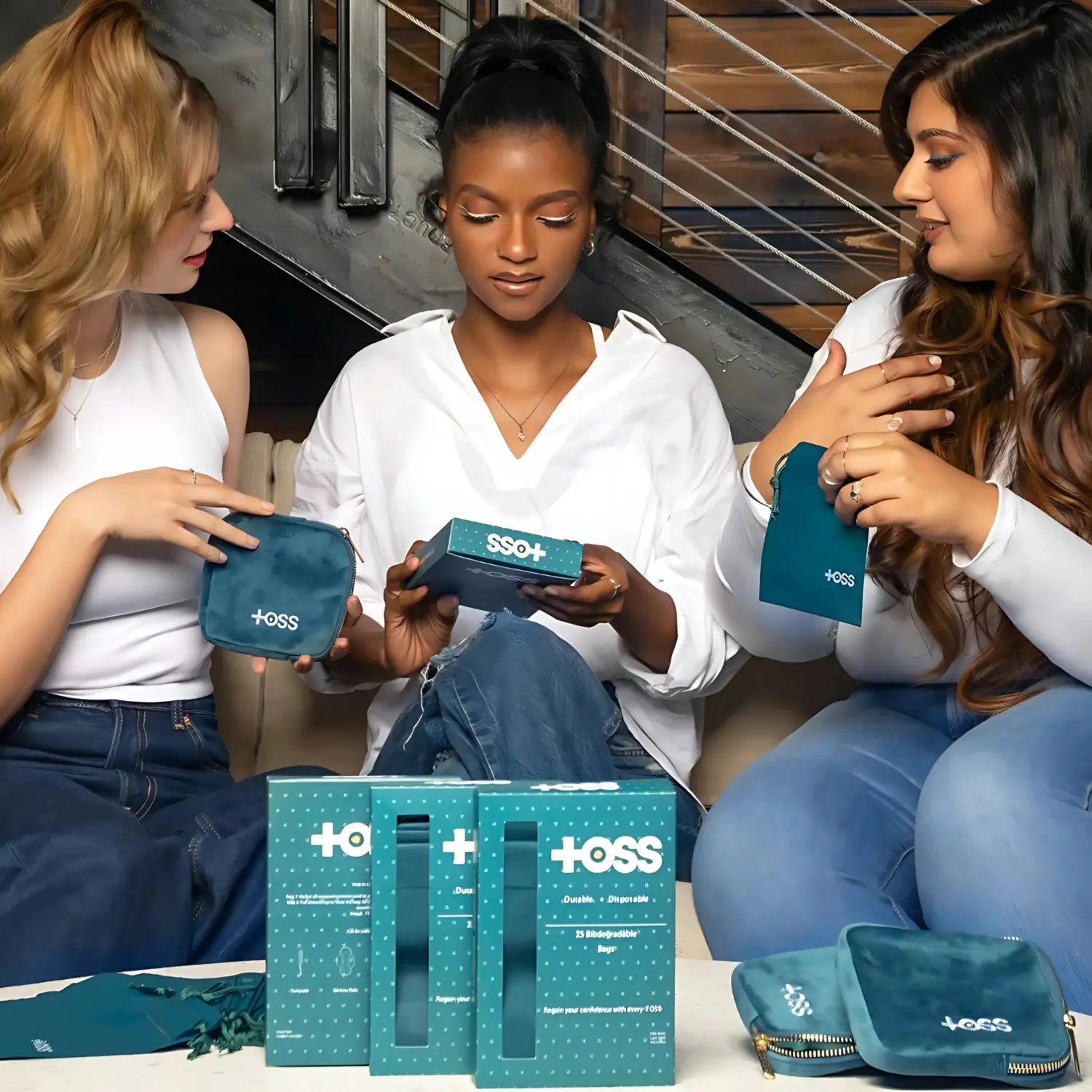
Show the product inside real relationships so utility becomes relevance.
One art direction that makes every new asset feel like the same brand speaking.
The visual system
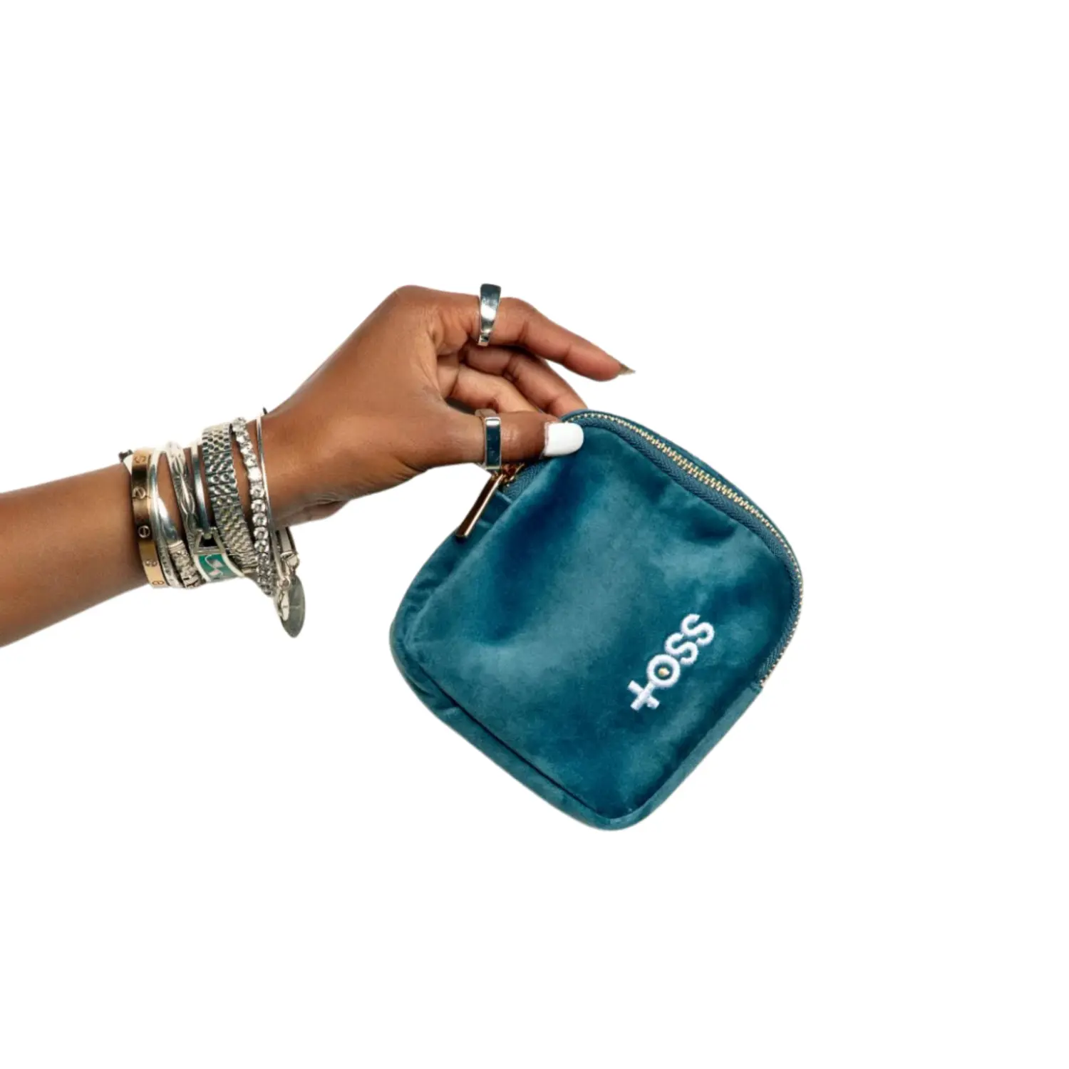
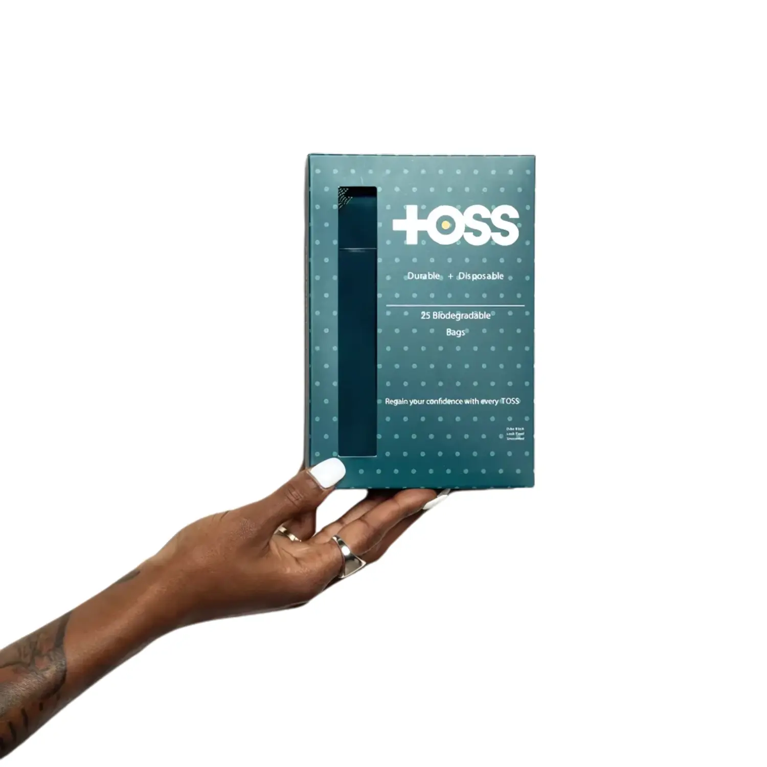
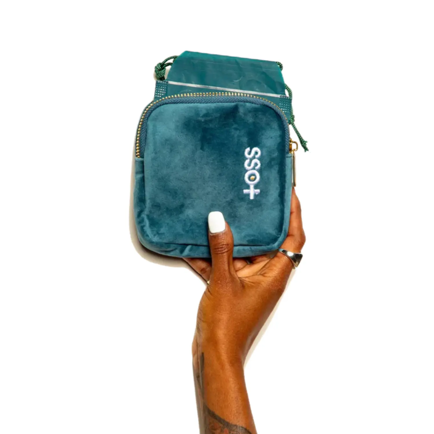
Campaign and product imagery, connected by one considered direction.
Your next move
The Brand-to-Buyer Website System brings strategy, copy, design, development, and digital imagery into one persuasive customer experience.
Explore the website packages